Eye Deceptions: The Evolution Of George D. Green’s Painting
From The Late 1970s To The Present
Dalton, Kristin (Fine Arts)
Fritz, Katie (Graphic Design)
Klein, Dustin (Graphic Design)
Meyer, Rachelle (Graphic Design)
Schanzenbach, Luke (Graphic Design)
South Dakota State University – Spring 2008
Course: ARTH 490 – Seminar BETWEEN OBJECT AND PROCESS
Guest Editor and Project Coordinator: Dr. Leda Cempellin, Art Historian
All the images of paintings by George D. Green are reproduced courtesy of the artist. Our sincere gratitude to Dr. Dorothy I. Mitstifer for the final revision of this essay and to Louis K. Meisel for his interest in scholarly projects on this artist.(Click images to view larger version. Javascript required.)
The 1980s: The Shaped CanvasIn the 1980’s, Green started working with shaped canvases. By shifting to a shaped canvas and filling it with shapes, the piece started to be perceived as a sculpture; the illusion of a three-dimensional object and the reality of the three-dimensional object make these pieces unique. The shaped canvas appeared at least as early as 1940, with Buenos Aires artist Raul Lozza ( Fig. 48: http://a.theoretic.org/arte/30.gif ): in order to avoid the term “abstraction,” artists of the Buenos Aires circle defined themselves “concrete,” therefore emphasizing the creation of new forms without reference to anything outside themselves.
When studying Green’s shaped canvas period, the influence of Elizabeth Murray upon his work is apparent. Like Green, she used shaped canvases and a pop color palette. It seems that the explosive visual energy was now the determining factor of the canvas, so that now he was unconcerned of rectangular shapes commonly seen in paintings. Elizabeth Murray’s 1981 Painter’s Progress ( Fig. 67: http://www.womansartjournal.org/images/27-1B.jpg ) is a good example of this. “She was toward (or possibly unconcerned with) reductive formal thinking and apparently ecstatic at the pictorial possibilities opened up by the relaxation of the rectangle’s grip” (Shape of Things to Come 208). Shaped canvas and layering now converge into one singular composition. The forms are not only coming out at the viewer but also going into the painting, and still the composition looks coherent. What has been written about Murray may be applied to Green as well:
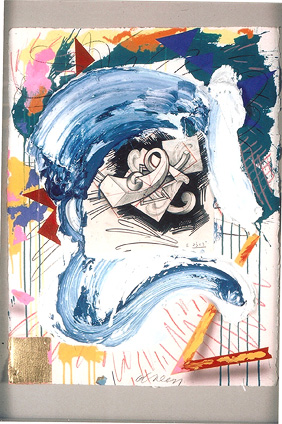
Murray’s Children Meeting, 1978 (Fig. 66: http://bp0.blogger.com/_ESC4bygtp2M/Rt_2TxIAHDI/AAAAAAAABRM/nxOz8pBGen8/s1600-h/Murray+Children+Meeting+1978.jpg ) and Green’s Holy Rollers (Fig. 5) both contain a chaotic lightning bolt, which in case of Holy Rollers weaves in and around the angular shapes, whereas in the T empest it weaves in and around the voluminous shapes:
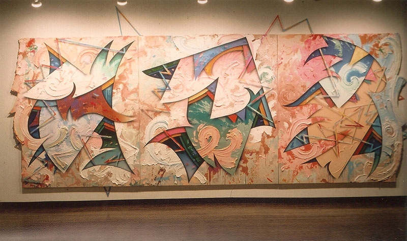 Figure 5. Holy Rollers, 1988 A lightning bolt element weaves itself in and out of the depicted shapes. The addition unifies the entire painting: it seems like a living element, which has the ability to snake itself anywhere in the multiple dimensions Green created. Both artists used the lightning bolt to create eye movement, leading the viewer throughout the painting, and both were influenced by the abstract work of Wassily Kandinsky. It is as if both Murray and Green took Kandinsky’s flat, two-dimensional compositions and brought them into the realm of three dimensions. For instance, in Green’s The Eccentric Beauty, 1988 (Fig. 11), we notice the abstract elements exploding from the center of the composition, and our eye is drawn to the pink and red lightning bolt shape. A direct correlation can be found in Kandinsky’s Quiet Impulse, 1939 (Fig. 46: http://richardtaylor.co.uk/kandinsky/quietimpulse.jpg ). Indeed, Kandinsky used the lightning bolt shape to express energy and create a strong directional force (Whitford 186). Green took the element to the next level by giving it dimension. 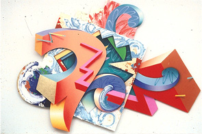 Figure 11. The Eccentric Beauty, 1988 In Green’s The Eccentric Beauty (Fig. 11), the lightning bolt shape appears to be moving from the right of the canvas to the left. “ Movement towards the left,” according to Kandinsky, is movement “into the distance or going outside” (i.e., as we read a picture from left to right, we encounter a movement in the opposite direction). This movement, Kandinsky said, is visually more adventurous than left-to-right movement, and seems to have greater intensity and speed. Movement to the right is movement “towards home,” “centered inwardly”:
The lightning bolt, found in Kandinsky’s Quiet Impulse ( Fig. 46), appears to have origination points on both the right and on the left side of the canvas. According to Kandinsky’s theory, the lightning bolt should be both energized and relaxed or be an activity level in between. Instead, in both Boogie Woogie Country Man (Fig. 6) and The Eccentric Beauty (Fig. 11), Green positioned his lightning bolt shape on the left side of the canvas, and allowed it to travel to the right side. The lightning bolt toned down the movement created by the other shapes in the composition. Although Kandinsky’s canvas kept the traditional rectangular proportions, the compositions therein are viewed as having an overall outer shape (Overy 118). Green’s shaped canvases from the 1980’s allowed the composition to break away from the binding square and rectangle format. This gave his work an evident energy and turned the painting into an object.
Green applied a similar idea in Invisible Clarities Breezing Asleep, 1987 (Fig. 7). Bound planes act as the anchor, from which organic shapes burst. In the shaped canvas period, Green cut out material of a plane to reveal the underlying layers. 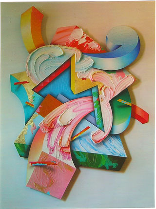 Figure 7. Invisible Clarities Breezing Asleep, 1987 Indeed, by filling up the canvas with irregular shapes, the piece starts to be perceived like a sculpture. The illusion of a three-dimensional object, due to the layering of depicted geometries, together with the actual reality of the three-dimensional object, caused by its overall irregular shape, makes these pieces unique. Frank Stella started to shape his canvases in the early 1960 in works such as Valparaiso Flesh and Green , 1963 ( Fig. 56: http://www.hiandlomodern.com/IMAGES/ART/PAINTING/stella.jpg ), where instead of creating a work using the traditional rectangular or square format, he combined simple forms, such as “V” and “L” shapes, thereby paralleling the Minimalist movement in sculpture. Both shapes include the pinstripe pattern. The pattern conforms to the shapes outside line and in doing so creates the illusion of depth (Turvey 364). Stella’s Jarmolince III, 1973 (Fig. 62: http://www.metmuseum.org/special/stella/images/stella_01_L.jpg ) is part of a series of shaped collage reliefs, in which Stella moved away from the flat surface towards rendering a three-dimensional space. In this work, Stella takes advantage of the power of the viewer’s eye to pick out negative shapes that surround the elevated portions of the relief. For every form, we see at least one counter-form. In terms of visual hierarchies, the negative shapes can become just as powerful as the positive shapes, thus creating a push-pull effect. The negative shape mirrors the positive and vice-versa; they both fight for dominance, but at the same time one could not exist without the other. Green’s style, as visible in Holy Rollers ( Fig. 5), is similar to that of Stella’s in Jarmolince III. Green created the illusion of actual three dimensions through the implementation of shadows, the overlapping of shapes, and the use of gradients and textures. Green again overlaps flat planes like those seen in Podge-Wade (Fig. 4). However, the idea is pushed further when Green adjoins three similar paintings together to form one large painting. The viewer becomes confused when attempting to discern what is real and what is unreal: which area is painted and which one is not, what is an actual dimension, and what is simply illusion. Every shape has a shadow and every shape is overlapped by another shape, which creates the overall meshing appearance of the piece. Everything is held together or supported by another piece. The overall meshing appearance keeps the eye grounded and prevents the piece from floating. Stella’s Raqqa II, 1970 ( Fig. 59: http://ncartmuseum.org/graphics/pics/collections/20th/1950-2000/036_lrg.jpg) includes overlapping semi-circles that seem to mesh together, yet they remain separated by the use of various hues. Where each semi-circle overlaps and touches another, new forms and directional forces are created. This effect makes it impossible for the viewer to find a start or a stop in activity. Similar to Raqqa II is George Green’s Untitled 9, 1976 ( Fig. 1) and Bare Narious Ojay, 1979 (Fig. 2). Green, like Stella, overlaps similar shapes to create meshing and at the same instance creates the illusion of depth between the elements. Directional forces keep the viewers’ eyes continuously moving, trying to find a focal point to rest upon. The exploration of pushing a canvas from a two-dimensional flat space into a three-dimensional sculptural form spawned from the Abstract Expressionist movement. Paradoxically, in Pollock’s work there coexists both the idea of painting as a process, where the freedom of the painting gestures “is made possible by the evenness of the distribution of visual activity” that has been defined as “allover structure” (Fineberg 92), and the idea of painting as object as Allan Kaprow defined it: “Pollock, as I see him, left us at the point where we must become preoccupied with and even dazzled by the space and objects of our everyday life” (Kaprow 26). Indeed, as in case of Full Fathom Five (Fig. 49: http://www.moma.org/images/collection/FullSizes/00323032.jpg), “Objects of every sort are materials for the new art” (Kaprow 26). 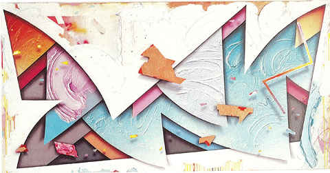 Figure 4. Podge Wade, 1981 The insertion, by Pollock, of everyday objects into the canvas switches the interpretation of the canvas from a “window” open to the illusion of third dimension to an independent object sharing the same reality with the audience. Indeed, Jackson Pollock’s work is a great example of life entering in art and becoming part of it. In Pollock’s Full Fathom Five, you can see nails, tacks, buttons, keys, coins, cigarettes, and matches enter the canvas’ surface. Unlike Abstract Expressionists, who added elements of reality into the canvas, Green created the illusion of reality through the canvas. The audience is not only drawn into the painting’s space, as in the Renaissance tradition, but the painting itself becomes part of the audience’s space. This crucial transition, in the meaning of the painting, has been achieved in the 20th century through a number of steps, which include the Cubists’ collage, Pollock’s allover compositions, the Happenings and Combines, and finally the shaped canvas that has been adopted by Green since the early 1980’s. However,
Through the use of shaped canvases in the 1980’s, both Stella and Green focused on the three-dimensional qualities and energetic brush strokes that seem to stretch out into the negative space. In Green’s Invisible Clarities Breezing Asleep , 1987 (Fig. 7), Green has used color and shape to create a three-dimensional space and give it the illusion of depth. Much like Green, Stella’s Il Drago e la Cavallina Fatata , 1986 (Fig. 70: http://www.akiraikedagallery.com/aw_stella.htm) also uses illusionism and relies on shadows to create different planes of space. The space is not only evident on the canvas but also outside it; the painting is a sculpture and forces itself into the viewer’s space by giving importance to the negative space around it.
The paintings by Stella and G reen invite the viewer to be part of the piece; with their often huge dimensions, they create an environment much like the Futurist artists were theorizing in the early 20th century in Europe, and the American artists have been able to achieve in the mid-20th century through Happenings and Environments.
One major difference is the mixed media that Stella uses and how that adds an actual three-dimensional quality to the work, whereas Green relies more on the illusionism of his painting technique to convey a sculptural quality. Stella actually adds pieces of reality to his paintings, much like Jackson Pollock and his piece, Full Fathom Five (Fig. 49: http://www.moma.org/images/collection/FullSizes/00323032.jpg ). Frank Stella also uses less shading and more flat space on his shapes; they seem less uniform and more random than Green’s more cohesive compositions. Both of the artists use collage techniques to support the illusion by creating layers. This use of collage is seen in Picasso and Braque (Fig. 40: http://home.vs.moe.edu.sg/whitenoise/Images/F_C_E/Picasso/SL_ChairCaning11-2.jpg ), and the importance of this technique, for later developments of mature Modernism, has been described by Clement Greenberg: “[C] ollage is a major turning point in the evolution of Cubism and therefore a major turning point in the whole evolution of modernist art in this century” (Greenberg 1989: 67). As we have previously mentioned, just a few years before George Green, Elizabeth Murray introduced the shaped canvas in her work, which came out of Frank Stella’s Minimalist works of the Sixties (Fineberg 440). The piece Her Story ( Fig. 69: http://www.artchive.com/artchive/m/murray/her_story.jpg) by Murray is very simple in structure, but all the shapes, lines, and colors resemble that of George Green. However, Her Story is made up of three separate piece of canvas attached together. Negative space seems to be a very strong factor in both the artists. A major difference is established between its use by the two artists; Green tends to use his negative space as frame for those push-pull dynamics and different layers, whose illusion is depicted in his painting, Murray uses it as actual part of the panels in order to emphasize the solidity of the work itself. In Green’s, Boogie Woogie Country Man, 1986 (Fig. 6), which is a large mixed media, the shapes are crowded, layered, and reaching out into the exterior space. Shaped canvases, such as this one, offer a more intense trompe-l’oeil effect to the viewer and also bring together all the ideas of Green in one cohesive product. This painting contains similar ideas and elements as in Holy Rollers (Fig. 5) but takes them in a new direction. Overlapping and shadows are used to make the shapes cohesive, but the piece as a whole has a whimsical, floating feel. Organic and geometrical elements flow in and out of other shapes; a lightning bolt element is used again to hold the pieces together, but this time its dimension is increased so that it assumes a more important role in the composition. Indeed, the pink lightning bolt acts as the main support element of the entire work and at the same time acts as the focal point, drawing the eye from near to far and vice versa, therefore acting as the strongest directional force in this complex piece. Green also included the paint smears not only on the flatter areas but also on elements that have dimension and travel away from the eye. Curiously enough, the texture he adds to those shapes, painted as three-dimensional illusions, does not take on a three-dimensional quality but remains two-dimensional. He is mixing two- and three-dimensions in the same object. This impossible scenario is a trademark of abstract illusionism. The elaboration of qualities, first seen in 1979’s Bare-Narious Ojay (Fig. 2) to the later Boogie Woogie Country Man (Fig. 6), is staggering. It is as if he took the strongest aspects of his previous work and increased them five fold. The layering and overlapping are much more interesting and energetic. Not only are there overlapping of forms but they are going through one another as well; he always draws or paints “something doing something—kicking, floating, spinning,” therefore giving life to his forms (Cohen 13). This is a whole new dynamic to his work that evolves throughout his career. The texture application is also more dramatic than before. Not only is it much heavier, but it also contains color qualities not seen in his earlier work. The volume of the geometric and organic forms really space this painting away from its (?) previous works. The volume of the geometric and organic forms in this painting really creates a contrast to his previous works. Perhaps one of the most dynamic and apparent transitional aspects of these paintings is the shape of the canvases. Boogie Woogie Country Man has such a high amount of visual energy that it cannot be contained in a rectangular canvas; it must be unleashed from its boundaries.
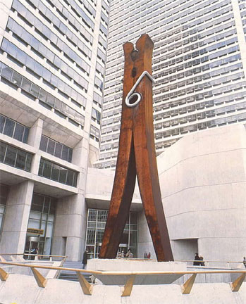
By using shaped canvases, Green pushes the viewers to experience something beyond what is known to them. The audience expects to see a painting in a closed rectangular binding box, not a loud explosion of forms that make up the painting’s edges. Claes Oldenburg challenged the spectators with works that would need to get out of the gallery and to occupy larger outdoor spaces; in this sense, his public works like Clothespin, 1976 ( Fig. 64: http://faculty.evansville.edu/rl29/art105/img/oldenburg_clothespin.jpg ) become analogous to the necessity by the abstract shapes depicted by Green (see Boogie Woogie Country Man, Fig. 6) to liberate themselves from the boundaries of the traditional regularly shaped canvas. Green has explained the purpose of his adoption of irregular canvas shapes in these terms: “Combining seemingly unrelated elements is a way to make visual energy” (Green 2/28/08). Sol LeWitt also expressed an explanation for this successful combination of forms: “[Because] no form is intrinsically superior to another, the artist may use any form, from an expression of word, (written or spoken) to physical reality, equally” (LeWitt 372). The exaggeration of those successful qualities, such as depth and texture and other unrelated elements in his compositions of the late 1970s, have forced this occurrence of change. In creating such a highly energetic piece, Green was also forced to choose certain colors to match the vigor of the paintings. Vivid crimson reds replaced pastel purples, oranges, and grays. These color choices also help produce the push-pull phenomenon seen in the work of Hans Hofmann ( Fig. 55: http://www.hanshofmann.net/art/goldenwall.gif). Unlike works like Bare-Narious Ojay (Fig. 2), Setting the Woods on Fire (Fig. 8), completed by Green in 1987, adds organic shapes to those geometric ones previously used. Even though he is still using some color pastels, the primary colors—reds, blues and yellows—become dominant; only a few forms are multicolored, which add a level of contrast with the single-toned forms. The difference with the predominance of dull colors in Holy Rollers (Fig. 5) is evident and anticipates the more exuberant phase of the late 1980s-early 1990s.
Colors can have many different effects, emotional and visual. Vassily Kandinsky, based much of his work on the emotional effects of colors. As Kandinsky said, “Color contains a force that is till imperfectly known but is real, is evident, and acts on the whole of the human body” (qtd. in Vallier 60). Not just color alone but also its hue and saturation contribute to raise emotions in the viewer. In Setting the Woods on Fire 1987 (Fig. 8) Green used primarily vibrant blues and light shades of yellow, red, and pink. A dark red is present but just episodically, possibly because the fire is not flaming yet but is only being set, as implied by the title. Vibrant and saturated colors give a more intense feeling than their dull, de-saturated counterparts. Color also works as a device to create depth.
Green uses color in his work to help create an illusion of depth and movement through push-pull. Hans Hofmann wrote in his essay, The Search for the Real:
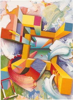 Figure 20. Gateway Star, 1991 In Hofmann’s The Golden Wall ( Fig. 55: http://www.hanshofmann.net/art/goldenwall.gif), the blue rectangles are almost of the same hue and should be on almost the same plane as each other; however, because the thin blue rectangle is almost surrounded by yellow, it is pushed forward into the viewer’s space, whereas the other seems to sit back behind the large red square in the middle of the painting. Hofmann was able to put his theory into practice by having one color react against another. “Hofmann’s distinction between shifting and overlapping rectangles – both retreating and advancing in space – is a subtlety that grew out of his concept of push and pull” (Fineberg 58). If we look at Green’s Gateway Star of 1991 (Fig. 20) and focus on the red square at the center top and the blue square at the right top, both squares appear to be on the same plane because they have a similar tone; however, the red square seems to push slightly higher because of the bright yellows used on three sides of the square, as opposed to the darker orange around the blue. In The Eccentric Beauty, 1988 (Fig. 11), the abstract shapes have grown not only larger, as this canvas stretches to 87 x 102 inches, but also more complex. Green has begun to shade darker colors by using different lighter colors: a blue shape is shaded with yellow, instead of dark blue or black. This strategy gives the shapes a more demanding presence. Paradoxically, shapes can be geometric and organic at the same time. Green has slightly changed or turned the shapes slightly to show us more than one side of each shape, adding to the three-dimensional illusion. Some of these abstract shapes also contain another great visual deception that Green is now evolving: the existence of a plane within another plane, which will become a typical feature of his exuberant phase of 1989-91. In The Eccentric Beauty, a red object resembling a lightning bolt streams into the subject matter existing on three different planes. Two of these planes exist inside other shapes or planes of the painting, making it hard to decide what objects are retreating or advancing. Green is now evolving his use of Hofmann’s push-pull by showing three-dimensional illusions inside other three-dimensional illusions and therefore increasing the spatial complexity and ambiguity. |
||||||||
|