Eye Deceptions: The Evolution Of George D. Green’s Painting
From The Late 1970s To The Present
Dalton, Kristin (Fine Arts)
Fritz, Katie (Graphic Design)
Klein, Dustin (Graphic Design)
Meyer, Rachelle (Graphic Design)
Schanzenbach, Luke (Graphic Design)
South Dakota State University – Spring 2008
Course: ARTH 490 – Seminar BETWEEN OBJECT AND PROCESS
Guest Editor and Project Coordinator: Dr. Leda Cempellin, Art Historian
All the images of paintings by George D. Green are reproduced courtesy of the artist. Our sincere gratitude to Dr. Dorothy I. Mitstifer for the final revision of this essay and to Louis K. Meisel for his interest in scholarly projects on this artist.(Click images to view larger version. Javascript required.)
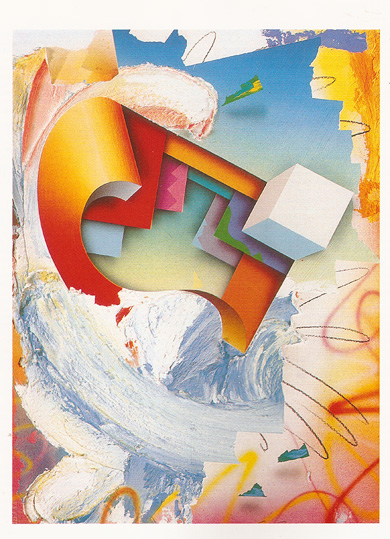
The Exuberant Phase: 1989-91The contrast of shaped canvases of the Eighties, such as Boogie Woogie Country Man of 1986 (Fig. 6), and a new series of paintings in a more exuberant phase of 1989-91 is remarkable. In Neskowin North Coast Blues, which started a series in 1989 (Fig. 12), Green kept most of the previous techniques and formal discoveries but applied them differently in order to create a painting going into space instead of coming out of it. If mature abstraction, as noted art critic Clement Greenberg has defined it in the 1940’s, consisted in the surrendering of the painting “to the literal plane surface” and “the physical nature of the medium” by progressively eliminating “black-and-white chiaroscuro, three-dimensional light effects, atmospheric and linear perspective” (qtd. in Hills 149), Green’s work can be considered audaciously postmodern in the re-insertion of all these traditional values that have been previously denied by modernism. Indeed, the overall impression of postmodern art is one of pastiche and appropriation, often promoting parody or irony and blurring the boundaries between high and low art. Art critics have not unanimously agreed upon a specific definition of postmodernism, and it is admittedly an all-encompassing, sometimes confusing, definition. Like premodernism and modernism, “Post-modernism can better characterize a sensibility than a style or a complex of styles” (Sandler 346). Premodernism, or Renaissance style, tried to solve the problem of creating a three-dimensional image on a two-dimensional picture plane. Greenberg stated that the “previous great evolution in Western painting led from the hieratic flatness of Gothic and Byzantine to the three-dimensionality of the Renaissance . . . . The immediate problem in painting was to fit the new perception of depth and volume into the flatness of the picture surface” (qtd. in Hills 147). Modernism, then, rebelled against the ideas of premodernism. Artists of this movement shunned the idea of illusion and did not subscribe to the notion that depth was achieved by pure representation. Rather, modernism was described as “ purist abstraction” (Sandler 345). The mark of the artist was shown in each brush stroke, completely unlike the smooth compositions of the Renaissance, where the illusion of the scene took precedence. Finally, postmodernism constitutes an eclectic synthesis of modernism and postmodernism:
This statement supports the idea that
Artists like George Green intertwine different techniques from different eras of art history in order to create hybrid postmodern artworks. “Postmodernism is an inclusive aesthetic that cultivates the variety of incoherence,” in that it incorporates “past styles in art without regard to their original intent” (Fineberg 365). Showing a deeply rooted postmodern sensibility, Green systematically uses “. . . the concept of paradox as a structuring agent. Combining seemingly unrelated elements is a way to make visual energy. . . . Ultimately everything goes with everything” (Green 2/28/08). How can George Green’s work using a combination of Renaissance tradition and modernist innovation be defined as postmodern? The Eccentric Beauty (Fig. 11) uses opposite color systems, vibrant oranges, pinks, and neon blues that contrast and seem to vibrate against one another. Blues and oranges (opposite on the color wheel) are very dominant complementary colors in this piece, creating a visual energy. Both minimalism and expressionism are present in this work. Simple, clean-edged shapes are minimalist in nature, with no ornaments or extreme detail. In contrast, abstract expressionism defines the gestural strokes with which these shapes are created. The forms are very fluid, indicative of the artist’s arm motions and brush strokes. Green’s strokes actually shape the canvas itself, and therefore the canvas does not constrict or shape the painting. In a statement in February 2008, Green said:
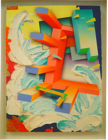
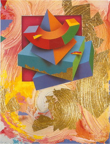
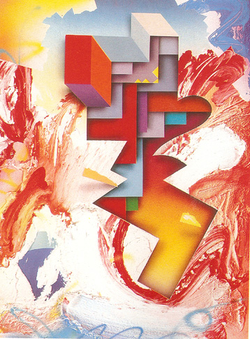
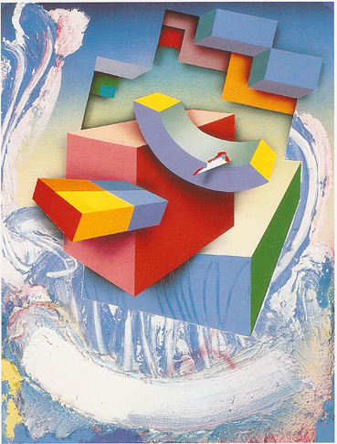
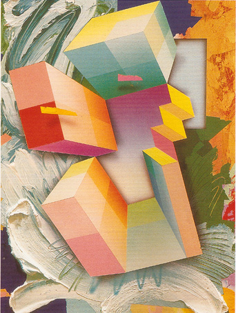
After returning to the States, Green continued this gesture-like style of shaping the canvas by applying color in thick layers. “. . . The canvas naturally, as the result of an action painting-like process, became entirely organically shaped” (Green 2/28/08). Indeed, Green’s work in this new period, like Neskowin North Coast Blues #6, 1989 ( Fig. 13), is characterized by shapes that instead of free-floating, like in the previous shaped canvases, now are supported by the cloud-like paint smears. Acting earlier as texture, now the light paint smears seem to hold up the weight of the solidly depicted three-dimensional shape composition; this paradoxical situation is created in complete disregard of visual weights. However, the relationship between the smears and the geometric blocks becomes a symbiotic one, as the smears emphasize the vibrant colors and hard edges of the blocks, whereas the geometric blocks emphasize the smears’ fluffy, organic appearance and pastel colors. In this painting, Green stacks four voluminous shapes in an awkward, unbalanced composition surrounded by a melting pot of colored paint smears. In Neskowin North Coast Blues #7 ( Fig. 14) and Neskowin North Coast Blues #8 (Fig. 15) in the same year, Green balanced the shapes as awkwardly as in #6, but he cut out a section of the paint smear background to reveal more of the overlapping flat planes. The setup gives the impression that the viewer is peering through a recent painting by Green into a previous painting by him in the late seventies and early eighties. Interestingly, an opposite interpretation could be applied according to the evolution of art history so that we may look from the Action Painting of the early fifties to the Hard-edge Abstraction of the following decade: the evolution of history can be viewed by visually entering the canvas from our own space to the progression in the illusory depths of the canvas. The chronological opposition, in the historical evolution of modernism on one side and in the artistic evolution of Green on the other, demonstrates his awareness of going counter-current in the new direction of being postmodern. Indeed, in complete disregard of Greenberg’s orthodoxy, Green created a sort of timeline and showed us he was moving in a new direction with his compositions, away from the flatness of the canvas and into more voluminous dimensions. The spatial dynamic shown in Neskowin North Coast Blues #10 ( Fig. 16) could be seen as making irony of the complex relationship between modernism and postmodernism; indeed, the abstract expressionist gestures, whose consistency is increased by the use of thickener, seemed to “eat” the simple, minimalist arrangement of forms that show progression in the illusory space created in the painting. Tropical Island Country & Western Suite #3, 1990 ( Fig. 17) consists in a composition of vibrant, voluminous shapes framing a gradient ranging from white to violet. But on further inspection, it becomes clear that the gradient, which was thought as looking into the distance, is in fact a side of another geometric shape. By visually following the yellow staircase to the right of the gradient, it is visible that the bottom step is part of another separate shape. This impossible visual scenario becomes the focal point of the work, possibly inspired by Joseph Albers’ exploration of “ perception, illusionism, and the often ambiguous interaction of abstract pictorial elements” starting from the 1940’s (Arnason 349) ( Fig. 52: http://caad.arch.ethz.ch/teaching/nds/ws96/script/space/img-space/albers-constellations.jpg ). Figure 17 about here Green’s illusion of depth has probably never been greater than that of Gateway Star, 1991 ( Fig. 20). In this painting, Green basically built a four-sided runway for our eyes to follow and shoot off into the infinite horizon. A good example of giving the viewer the illusion of infinite space is the Ceiling Fresco in the Palazzo Ducale created by Andrea Mantegna from 1461 to 1474 (Fig. 36: http://cache.eb.com/eb/image?id=99427&rendTypeId=4 ). Here, the artist created an illusory scene of angels looking down through an opening in the ceiling. The angels surround the circular opening under a blue sky with puffy clouds. The eye is led to the “opening” through the use of concentric circles, like a bull’s eye. The artist has basically built a four-sided runway for our eyes to follow and shoot off into the infinite horizon. Don Eddy described Green’s Gateway Star (Fig. 20) as having “seven separate notions of what constitutes proper space in painting,” where the “paradoxical space” is “simultaneously flat and atmospheric.” These so different spaces include: the primed canvas, still visible in the bottom center of the painting; a few “odd sprayed paint marks,” which are a casual product, as “they seem almost unconscious of their fluidity;” some parts applied through calculated gestures; the overall reading of the primed canvas and marks as emphasizing the flatness of the painting; the interpretation of the same primed canvas as a void, where shapes and marks are free to float (Eddy 2), and so on. The equal attention, that Green distributes in both geometric forms (with vibrant colors) and gestures (whose consistency is once again emphasized by the thickener), can be seen again as a postmodern way to reconcile the opposites in the even distribution of dripped paint through Pollock’s allover compositions, as much as in the attention to details evenly distributed without creating hierarchies of imagery by the photorealist’s sharp focus:
Green’s works give new meaning to the phrase “opposites attract,” and he pulls it off with grace and precision. The central complex geometric shape in Gateway Star acts, in traditional premodernist terms, as a window, which opens the illusion of depth in the actual two-dimensional limits of the picture plane towards an abstract horizon with green land and blue sky. All but one of the three-dimensional geometric shapes appears to recede back to a common vanishing point, making the abstract horizon feel much deeper than it would be if the artist used only shading. The thick sculpted paint is no longer just a texture for shapes or objects but it has grown to become an object of its own as it wildly and organically twists over, under, and around the geometric shapes. Another element that has been consistent in Green’s work so far is the painted torn fragments of tape that float randomly in the work. In Gateway Star ( Fig. 20), these tape fragments still appear to float unattached, but now they appear to float within the images instead of above them. The green and blue piece of tape in the lower left seems to be placed deeper inside the space than the red, white and yellow fragments that form the square at the bottom left side of the painting. Also, when one compares the same green and blue piece of tape to the yellow and green one above it, the two first appear to be sitting almost parallel to each other with the horizon. However, upon further inspection of the yellow and green piece, it seems to be floating out from the horizon, with the geometric shapes on a perpendicular line. Finally, we notice very small fragments of painted tape that appear to be floating, but within the frame of the horizon. The tape fragments existing on different levels of an invisible plane constitute an interesting maturation of the push-pull dynamic.
|
||
|
