Eye Deceptions: The Evolution Of George D. Green’s Painting
From The Late 1970s To The Present
Dalton, Kristin (Fine Arts)
Fritz, Katie (Graphic Design)
Klein, Dustin (Graphic Design)
Meyer, Rachelle (Graphic Design)
Schanzenbach, Luke (Graphic Design)
South Dakota State University – Spring 2008
Course: ARTH 490 – Seminar BETWEEN OBJECT AND PROCESS
Guest Editor and Project Coordinator: Dr. Leda Cempellin, Art Historian
All the images of paintings by George D. Green are reproduced courtesy of the artist. Our sincere gratitude to Dr. Dorothy I. Mitstifer for the final revision of this essay and to Louis K. Meisel for his interest in scholarly projects on this artist.(Click images to view larger version. Javascript required.)
The Late 1970’s: From Real Objects to a Trompe-L’Oeil Process
The consequences of this discovery are early paintings, such as Untitled #9 (Fig. 1), 1976, a composition depicting banners. Green created an illusion of a rich texture by painting these banners one on top of the other and by giving each of them its own shadow, in order to make them appear as emerging out of the canvas. Green incorporated the painted illusion of masking tape fragments that became part of the depicted subject and at the same time echoed the painting process. This idea has only few antecedents in the past; in Letter Rack, 1658 (Fig. 38: http://wwar.com/newsletter/images/2002/10/2002-10-14-4946.jpg), Wallerant Vaillant painted letters, on a wooden board, that were kept in place by nailed down strips of tape. In Untitled #9 (Fig. 1), the banners are positioned to make them coalesce in the center of the composition, with the addition of the orange banner in the central zone of the canvas. The banners combine to form a triangle that points downward. In this painting, as much as in Bare Narious Ojay, 1979 (Fig. 2), a push-pull dynamic is starting to develop, which is indebted to Hans Hofmann (see The Golden Wall, Fig. 55: http://www.hanshofmann.net/art/goldenwall.gif): “To create the phenomenon of push and pull on a flat surface, one has to understand that by nature the picture plane reacts automatically in the opposite direction to the stimulus received” (Hofmann 1967: 44). Green interpreted Hofmann’s push-pull dynamic in these ways: in Untitled #9 (Fig. 1) by having the banners’ shapes going inward and outward, in Bare-Narious Ojay (Fig. 2) by inserting thick brush strokes that seem to extend the flat shapes into the third dimension, and also through a complex spatial interplay between some masking tape scraps, the frame, and the banners, all pictorial illusions. Indeed, the pieces’ own shadows are placed at a good distance from them, suggesting that the masking tape is much closer to the viewer than the rest of the painting. The shadows also allow them to freely float above the banners. Therefore, whereas the banners appear heavier and act as a backdrop, the depicted pieces of tape rise up and leap towards the viewer. In Bare-Narious Ojay , Green directed the abstraction inward, unlike his later shaped canvases. Not only does Green use layering, but he also provides objects that seem to float with the use of shadows, which add another plane of existence. When you are looking at this piece, your eye starts with the floating shapes and is pulled inside the layers; this gives the painting a push pull effect. Green uses soft edges and shadows to define his shapes that are sharp; this creates tension around each object. 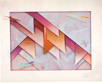 Figure 2. Bare-Narious Ojay, 197 The masking tapes, which carry the same pastel tones of the banner forms, become the objectification of the painting process itself; indeed, Green explained their genesis as “Another example of acceptance of chance and error,” a discovery, during the painting process, that lead to a major modification in the next series of paintings:
In Bare-Narious Ojay (Fig. 2), one piece found its way outside of the composition and overlapped with the white frame, thus creating the illusion of invasion in the spectator’s space:
This visual narration that Green illustrated for us in all his paintings can be traced back to the Renaissance. “ It is necessary that the artist move from section to section following the course of time in the narrative he has undertaken to paint, and do so with such propriety that the spectators judge that this affair could not have taken place in any other way than the one he depicted” (Andrews 77). The hierarchy of this visual story, which was set by the artist to have control over the viewer’s look, draws emphasis to the objects in relation to their degree of depth.  Figure 3. Fox Trot, 1981 The 1981 painting Fox Trot (Fig. 3) appears to act as a window that visually gives access to another space filled with abstractions. This window is not the traditional frame but rather an abstract form shaped as a negative space, with tight and wide angles, a curve that bubbles out the top right corner, and a curved spear-like form that attempts to sharply reenter or contain the space beyond the window. These shapes are layered and appear to float around each other, but they do not seem to touch. This illusion was created by a combination of two techniques that Green mastered over the course of his work. First, the shapes are brilliantly colored; when a shape emerges from underneath another, it has a dark hue and shades off to a lighter one, creating a push-pull effect. Second, the shapes and irregular frame cast shadows over each other in order to show that there is space in between. Green breaks the content out of the irregularly depicted frame with a large green triangular shape that comes from within and out over it in the bottom right corner. He also breaks the canvas from behind by allowing the right pink curve within the irregularly depicted frame to reappear outside the canvas at the right side of the painting. These two major shapes that break out attempt to tie the viewers’ world with the world inside the canvas. Other elements, which tie the two worlds together, are the already mentioned pieces of painted tape that are stuck on or hover over the rest of the illusion. These hovering forms of color feel disconnected from the canvas and seem to float out to the viewer. The texture of many of the forms appears to be thick layers of sculpted paint that flow in a wild abstraction similar to the shapes they cover. The canvas framing the illusion seems to have been a byproduct of the creation, not planned but splattered, dripped, or rubbed upon accidentally during the creation of the space within. |
||
|