Eye Deceptions: The Evolution Of George D. Green’s Painting
From The Late 1970s To The Present
Dalton, Kristin (Fine Arts)
Fritz, Katie (Graphic Design)
Klein, Dustin (Graphic Design)
Meyer, Rachelle (Graphic Design)
Schanzenbach, Luke (Graphic Design)
South Dakota State University – Spring 2008
Course: ARTH 490 – Seminar BETWEEN OBJECT AND PROCESS
Guest Editor and Project Coordinator: Dr. Leda Cempellin, Art Historian
All the images of paintings by George D. Green are reproduced courtesy of the artist. Our sincere gratitude to Dr. Dorothy I. Mitstifer for the final revision of this essay and to Louis K. Meisel for his interest in scholarly projects on this artist.(Click images to view larger version. Javascript required.)
The Late 1990’s-Early 2000s: Pictures from the Monroe and BeyondThe use of trompe-l’oeil in painting dates back to the Pompeian frescoes.
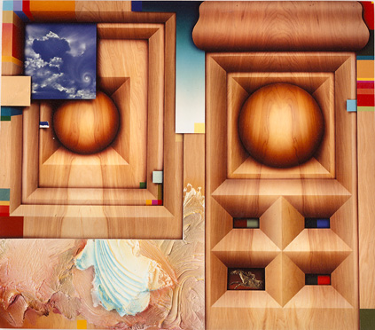
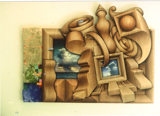
In Jockey of Artemisium, 1997 ( Fig. 21), George Green painted, in a very convincing trompe-l’oeil style, wood carved elements with delicate, stained wood grains. In addition to wooden frames, Green has depicted wooden spheres to create depth. Jockey of Artemisium, Gravityspool, Untitled, A Natural Wonder, and Horizon all have both the frames and spheres present. Rene Magritte’s Green Hills ( Fig. 45), echoes the same sort of chimera. Here, a spherical, tower-like object is seen on the horizon, past the painted mountain forms of the work. Additionally, a dress form in the lower left corner of the composition adds to the three-dimensional illusion. As with Green, Magritte incorporates painted elements along with realistic three-dimensional forms to create a somewhat surrealist, postmodernist composition. In Jockey of Artemisium, Green painted highlights and shadows to represent depth and fool the viewer into believing they were looking at actual alcoves and niches. A central element is the wooden sphere enclosed by a geometric framework consisting of fitted, beveled layers that act as hallways. The sphere appears to rest within this hallway. Similar to Jockey of Artemisium is the illusion created by Italian Renaissance artist, Baccio Pontelli in Studiolo , 1476 (Fig. 37: http://www.metmuseum.org/store/images/Z.pr.B0206.L.jpg ) located in the Palazzo Ducale in Urbino, which
Similarly, in Jockey of Artemisium ( Fig. 21), Green included two of these sphere or square elements that seem to differ in scale; however, at further inspection it is clear that the smaller of the two spheres is at a further distance from the viewer than the larger, closer sphere. Four wooden alcoves lie beneath the larger sphere and within them sit three bicolor swatches, one horse and one rider figurine created in trompe-l’oeil style. Instead of rendering shapes with no context, Green incorporated wood grain into his forms so that the qualities of volume and depth have returned. He painted highlights and shadows to represent depth and trick the viewer into believing they were looking at actual alcoves and niches. The wood grain pattern had abstract qualities itself; however, painting the wooden surface in such a realistic way gave the piece a more three-dimensional effect.
Green’s choice of creating frames inside the canvas instead of around the piece was a radically new idea. Because the frames lay inside the plane, the painting had no limitations and no end; therefore, it was free to stretch into the reality around it. Another addition to Green’s composition was the scenery. In the upper-left hand corner, he painted a peaceful cloud scene where puffy and wispy clouds intermixed. A hurricane-like twirl of delicate clouds acts as the focal point in the cloud scene. Again Green used the trompe-l’oeil style to represent the clouds. Because of the flatness of this sky image, which is increased by the contrast with the visual solidity of the wooden abstract shapes and which paralleled the picture plane, the artist is tricking the viewer into thinking that they are seeing not actual clouds but a smaller painting within a larger painting. The cloud scene could pass for a cropped fragment from another painting, which Green could have placed into this composition; this would again recall the postmodern attitude towards visual citation, here visualized only as part of a hypothetical process. Again, this aspect could be traced back to the work of René Magritte. In The Human Condition, 1934 ( Fig. 44: http://www.uh.edu/~englmi/i/trompe/trompeloeilBorges-01.jpg), Magritte created a situation in which the viewer is facing a window and is peering out onto a generic landscape. The artist placed the image of an easel in front of the window, blocking the view. On the easel rests a canvas that includes the exact landscape scene behind it.
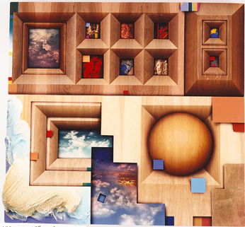
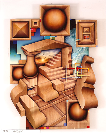
It is as if the viewer is allowed to see the making of a trompe-l’oeil painting within a trompe-l’oeil painting, which involves the visualization of the art-making process. Not only are we fooled once by the magic of the illusion of reality created by the painting but we are also fooled a second time on further inspection of the scene. The horse figurine found in Jockey of Artemisium can be traced back to a work created earlier by the Photorealist artist Ben Schonzeit. In Horse and Rider, 1974 ( Fig. 63: http://www.benschonzeit.com/content/seventies/seventies/1_horse_ryder.html ), Schonzeit painted a photorealistic chrome hood ornament of a jockey atop a racehorse in full stride. Green substituted the chrome with a bronze coating. The artist may have placed the figurine in the depicted geometric alcove in order to pay homage, through citation, to trompe-l’oeil art of the past and then to eclectically place it inside an abstraction; in this way, a complex painted structure is created, where realism and abstraction paradoxically coexist. In the painting Gravityspool, 1997 ( Fig. 22), Green took the beveled alcove elements to the next level by increasing their numbers from four smaller ones to eight larger ones. Within six of the alcoves, Green painted a common theme: the classical civilizations. The alcove in the bottom left of the series is easily recognizable as a detail from the Aphrodite of Delos ( Fig. 34: http://rack1.ul.cs.cmu.edu/greek/greek5.htm ), a Hellenistic statue of ca. 100 BCE, whose ironic and playful tone (Kleiner & Mamiya 160) is analogous to the irony used to play with formal representation and abstraction and whose monochromatic red tone reminds us of Yves Klein’s Antropometrie or monochromatic sculptures ( Fig. 53: http://members.aol.com/mindwebart3/arman.jpg). The above center alcove clearly contains a detail from the golden Funerary Mask of Mycenae, Greece, ca. 1600-1500 BCE ( Fig. 33: http://www.ou.edu/finearts/art/ahi4913/aegeanslides/135.jpg). Other alcoves contain Greek vases, statuary, and reliefs: curiously three-dimensional works that have been reproduced as flat paintings, which struggle among the more intricate wood carvings, abstract and solid at the same time. The remaining two alcoves contain non-representational color compositions, as in previous paintings. Green also pushed the cloud scenes from one image to three. Whereas the scene in Jockey of Artemisium (Fig. 21) is frameless, in Gravityspool (Fig. 22) two of the three scenes are now enclosed in beveled frames. The frameless cloud scene does not seem to sit solitarily, like the one we see in the previous painting; it is now held into place by wood paneling, which produces a flat stair-stepped type of shape. However, at the bottom of the picture, a paint square seems to float in space, causing the viewer to question if the other paint squares are really tucked between the trompe-l’oeil frames or just floating. Green is constantly making the viewer question what is reality and what is fantasy. In Untitled, 1997 ( Fig. 23) Green not only inserts more wood grain elements but he also visually composes them into more intricate “architectural” pieces. The painting contains one cloud scene, which is not framed like in previous paintings but instead is held in place by an actual wooden staircase. In order to increase the believability of these solid abstractions and to relate them to the audience’s real space and experience, Green painted a floor and inserted them on it. The geometric shapes and organic forms are now depicted illusions of carved pieces of wood, which seem to be in the process of assembling themselves into an environment. Some are in place, and others seem to be floating unattached around the environment, looking for a place to fit. The thick sculpted paint is still a part of Green’s work, but it has now receded into the background, creating a hidden environment of rough texture among the rest of the smooth wood-like textures. The horizon inside the pyramidal central frame has become a realistic sunset, making a new interpretation possible; the viewer has been sucked into this abstract world and is looking back out the pyramidal frame at what was once their reality. Indeed, the only image that still penetrates the pyramidal frame is a group of stairs, possibly an optional way back to reality on a mental level for viewers, so they do not feel trapped inside this new world into which Green has thrust them. The blue and yellow painted tape fragment, in the upper right corner, is no longer floating. The piece looks as if it wants to float because of its shadow against the wooden surface, but it seems held in place by the level containing the sculpted paint. A complex section of these tape pieces floats on the right side of the painting, but it look as if it is made of pieces which have been cut and painted with a straight edge and are arranged in a grid-like pattern. The remaining floating colors, towards the upper and lower extremities of the canvas, seem to be evolved pieces of the torn tape fragments that have become strict geometric boxes, resembling computer pixilation, that no longer have the ability to float. Indeed, common forms in Green’s paintings are the torn pieces of painted tape that he would randomly stick to his paintings until he found a satisfying location. These fragments of painted tape have evolved throughout Green’s career into geometric forms of color for a period of time. These are evident in A Natural Wonder, 1998 (Fig. 24) and Untitled, 1997 (Fig. 23), where they exist as floating geometric grid-like tape fragments and pixilated squares of color. When we look at these elements, we are reminded of Piet Mondrian’s grid or checkerboard paintings, specifically Broadway Boogie-Woogie, 1942-43 ( Fig. 47: http://www.moma.org/images/collection/FullSizes/00303025.jpg ). Mondrian’s grid-like forms of pixilated color resemble some of the painted tape fragments of George Green. Mondrian also used colored tape to aid him in the creation of some of his paintings. “In New York, Mondrian devised a method of composing with commercially available colored tapes that he could easily shift around the canvas until he was satisfied enough to commit paint to canvas” (Arnason 361). Mondrian’s nonobjective art and Green’s early works are illusions of line and color that seem as similar as they do different. Tropical Island Country and Western Suite #3 ( Fig. 17), Neskowin Spring Suite #11 & #12 (Figs. 18 & 19) and Gateway Star (Fig. 20) appear as Mondrian-like paintings that have exploded. Mondrian felt that
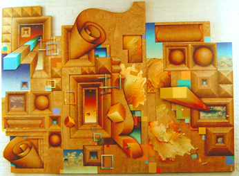
Green’s paintings also constitute an interplay of lines and colors but not uniformly contained as in Mondrian’s work; rather they are thrown out at the viewer for interaction. In Untitled ( Fig. 23), Green added a new element: an eye peering through one of the frames in the upper left corner of the painting. Green’s usual themes of stretching into the distance and going on into eternity are enhanced by this imagery. Perhaps the artist is suggesting that we are not the only ones looking out into the distance. The eye could be representative of something looking back at us from the future or watching over us in the present. The viewer is looking at the painting and observing, but at the same time the painting or the painter is observing the viewer. Green could be suggesting that the process of art is a two-way street. The artist is not simply trying to connect with the viewer. Conversely, the viewer is not simply trying to get some meaning out of the artwork. The two forces must work together in order to complete the artistic process. The highest degree of involvement of both artist and audience, in the creative process, was historically started with the “Happenings,” collective events in which people attempted to “ close . . . the gap between art and life” (Hopkins 104) by taking an active role during the artistic process. In one particular happening, Emmett Williams’s Counting Song (1962), Williams simply counted the audience (Hopkins 105). This event, in a very direct way, does the same thing as Green’s eye peering from the painting. He too is forcing the viewer to take an active role in the artistic process by visually involving the audience and challenging individuals to complete the meaning of the painting. A similar degree of audience’s involvement has occurred during a happening by Claes Oldenburg, titled The Store ( Fig. 54: http://www.tfaoi.com/am/6am/6am49.jpg ). Grotesquely obscure objects, dripping with paint and misshapen, were the wares that filled the store space. Oldenburg was challenging the usual thought of art distribution. He eliminated the gallery, taking his fine art directly to the consumer through use of a store (Hopkins 109). Oldenburg invited people to come into his store, browse, and even buy the objects on display. In this way, The Store could not exist (or be nearly as effective) without the audience’s participation. In Green’s Gravityspool ( Fig. 22) the viewers cannot walk through his space with their feet, like in Oldenburg’s piece. However they are certainly challenged to walk through it with their eyes. By looking through the painting, the viewer brings his or her own experiences and thoughts to analyze the artist’s message. At the same time, the artist (or “the eye”, in Green’s work) tries to communicate a message or a feeling to the viewer. Horizon, 1999 ( Fig. 25) is a complex wood-like composition that partially obstructs the view of an imaginary nature-like world in the background that is undergoing a strange metamorphosis to pixel-like flat little squares already seen in Untitled ( Fig. 23); this process of transformation reminds us of the one occurring in Pat Steir’s The Brueghel Series (A Vanitas of Styles), 1981-83 ( Fig. 68: http://bp0.blogger.com/_j0_0cXEXWWU/RfWg5W4Y9yI/AAAAAAAAAUU/sOa6zz-EY3I/s1600-h/TheBrueghelSeries2.jpg ) . In Green’s painting, pieces of painted tape, paint daubs, and painted squares continue to be added at the top of the composition to alert the viewer of the illusion. Green seems to be finding new ways of incorporating more realistic qualities, while keeping true to his abstract base. In Horizon ( Fig. 25), Green is also experimenting with new textures and challenging himself to paint on wood grain. The wood grain has abstract qualities itself, and adding such a realistic surface gives this piece even more of a three-dimensional effect.
As we already said, Green’s choice to create frames inside the canvas, instead of around the piece, is a radically new idea. Because the frames lay inside the plane, the painting has no limitations—no end—and is free to stretch into the reality around it. At the same time, Green is creating an exact replica of a painting which reminds us of an Audrey Flack piece that does something similar. Although Flack is not trying to trick you by creating an illusion, her work and Green’s work have a similar ironic value. In Marilyn (Vanitas) , 1977 (Fig. 65: http://www.csupomona.edu/~plin/women2/images/flack_big.jpg ), Audrey Flack not only paints a photograph but she is also working from a photo, thus painting a photo of a photo. This piece is not only very technically accomplished but there are three different perspectives contained in one painting. There is the reality or the actual photograph, there is the painted photograph, and finally there is the reflection of the photograph through the mirror. This sort of irony is found in Photorealism as well as in George Green’s work. Even conceptual artists, like Joseph Kosuth, have been interested in the idea that there can be different forms of one object ( Fig. 58: http://www.pucsp.br/rever/rv4_2005/t_grieve4.jpg), and they are all valid.
Green’s painting Horizon ( Fig. 25) and Romare Bearden’s collage The Dove ( Fig. 57: http://www.lagcc.cuny.edu/psychology/moma/images/closer/bearden.jpg ) both could be perceived as bringing together seemingly unrelated imagery to echo the chaos of the city. As Dr. Cempellin reminded, both artists lived in New York City at some point in their lives. However, they lived in different neighborhoods, and different sections of New York City are like different cities all on their own. The culture, the life, and the people are unique to each neighborhood. Inspiration for visual assemblage is still dominant for both artists, who use a combination of vibrant images to create their work. Bearden’s interpretation of the city’s chaos is more literal, with the collage action taking place in a street scene, with people bustling about. Instead, Green’s chaos employs abstract forms to echo people, color, vibrancy, and life of the city. Furthermore, both Green and Bearden employ “shift[s] in scale” (Fineberg 396) and change the shapes of their forms to encompass empty or complex spaces. The negative and positive shapes created by Green and Bearden’s forms add to a visual tension that is present in both Horizon and The Dove. Figurative and abstract forms coexist in both works. Bearden’s painting uses a minimalist grid system, but the chaotic scene inhabiting it camouflages the grid. This system of organization, then, is quite paradoxical. As a reference, Frank Stella’s Lake City ( Fig. 60: http://www.blockmuseum.northwestern.edu/full/1985.87.5.jpg ) is a quintessential minimalist grid, using simple lines and shapes to create visual organization. Bearden’s work employs this type of grid as well, but he certainly takes more liberties with its organization. For Stella, Lake City is order and grid formations; for Bearden, The Dove is the representation of chaos. This chaos keeps the eye moving around the painting, whereas the grid gives the eye a road map to follow. It lends cohesiveness and order to the work, amidst all the chaos. The analogy, then, is accurate. New York City, like The Dove, certainly has chaos and bustling, vibrant life. However, beneath it all are subways, streets, and an order of business that lend a certain structure to the city—they keep it running smoothly. It is that paradox that makes New York City, and in turn Bearden’s work, so intriguing. The same could be said about the relationship between order and chaos in Green’s Horizon ( Fig. 25); however, this polarity seems to originate from the opposite characteristics of the places where Green divided his time, where the chaos would recall the city, and where the order of the framed sky and seascape imagery would be provoked by the memories of horizon-inspired, naturalistic views outside the city:
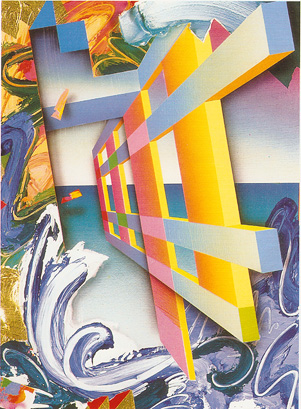
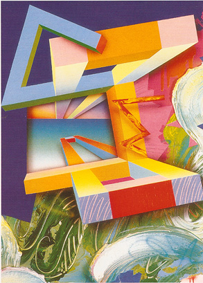
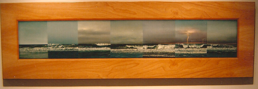
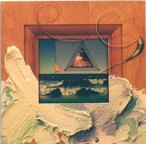 Figure 27. Pictures from the Monroe - Focus 27, 2001 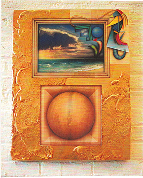 Figure 26. Picture from the Monroe - Sphere, 2001 Therefore, it is possible that the change of Green’s imagery from vivacious to horizontal have been caused by sudden changes in the artist’s location. Indeed more recently, in 2005, Green moved from New York to Oregon; perhaps Green’s surroundings are becoming more like those ocean waves. Indeed, George Green’s style changed considerably over the years, so much so that he himself admits that the work looks as though a completely different person could have created it (Green 2/18/08). For contrast, we look to The Eccentric Beauty ( Fig. 11), with its sweeping geometric forms, illusions of depth, and opposite color systems. Splotches of color and paint daubs add a refreshingly organic element that contrasts the hard-edged, organic shapes. Minimalist tendencies are contrasted by sweeping gestural forms that seem to continue off the picture plane to some unknown destination. Later, in 2007, the painting Seven Days ( Fig. 29) looks like a “photomontage” of waves. Closer to the right side of the work is a wave scene being struck by lightning. What a contrast to Green’s work of the late 90s! Green’s painted frames and paint daubs continued to be part of his works into the early 2000s as well. In Picture from the Monroe: Focus 27, 2001 ( Fig. 27), Green incorporated the paint daubs in an interesting and innovative way. The imagery at the center of the piece represents ocean waves crashing onto the shore. A trompe-l’oeil wooden frame surrounds this image. Painted atop the wooden frame are the paint daubs, which are strangely evocative of ocean waves. This technique makes it seem as if the imagery behind the frame is coming out into the realm of the viewer. It is evident that Green still enjoys wandering the fine line between fantasy and reality, while at the same time changing the purpose of some of his techniques. Green changed the treatment of framing in this piece as well; in the center of the sky imagery, Green added a “reverse frame,” which seems to recede into the background instead of coming towards the viewer. In contrast to his previous works, where frames seemed to pop into the foreground, Green treats this frame in a way that it goes behind the sky. This change of elements supports the theory of postmodernism as viewing “both images and concepts as radically polyvalent” (Fineberg 365). Indeed, postmodernism does not assign one meaning to an image or concept; each image can have several meanings, which can be interchanged by the artist at will.In all of George Green’s works between the late 1990s and the early 2000s, the spatial complexity increases, with clusters of wooden elements, substantial trompe-l’oeil frames, paint daubs, painted paint strips, and background imagery adding to the effect of depth. It seems as if the viewer could walk through the painting, traveling into space, and observing different elements of the painting along the way. Green is very effective in making his work seem to extend into infinite space. In another late 2000s piece, Pictures from the Monroe: Sphere, 2001 ( Fig. 26), paint daubs create a receding frame structure, not a large, protruding wooden one as we would expect, in order to block the sky imagery. Geometric shapes play around the frame, dancing in and out of the sky imagery, and therefore creating a Renaissance-like space of continuous narration. This keeps Green’s theme of fantasy and reality alive and adds depth to the piece. Below the sky imagery, a common element in Green’s work appears again: a large wooden sphere, distinctly framed and appearing to protrude from the picture plane. The ocean and sky imagery in the top portion of the painting is vividly colored; the contrast with the uniformity of the wooden-like imagery adds to the illusion of depth in the piece. No matter how the imagery evolves, the illusion, which each time takes different form, remains consistent throughout the entire career of Green.
|
||
|
